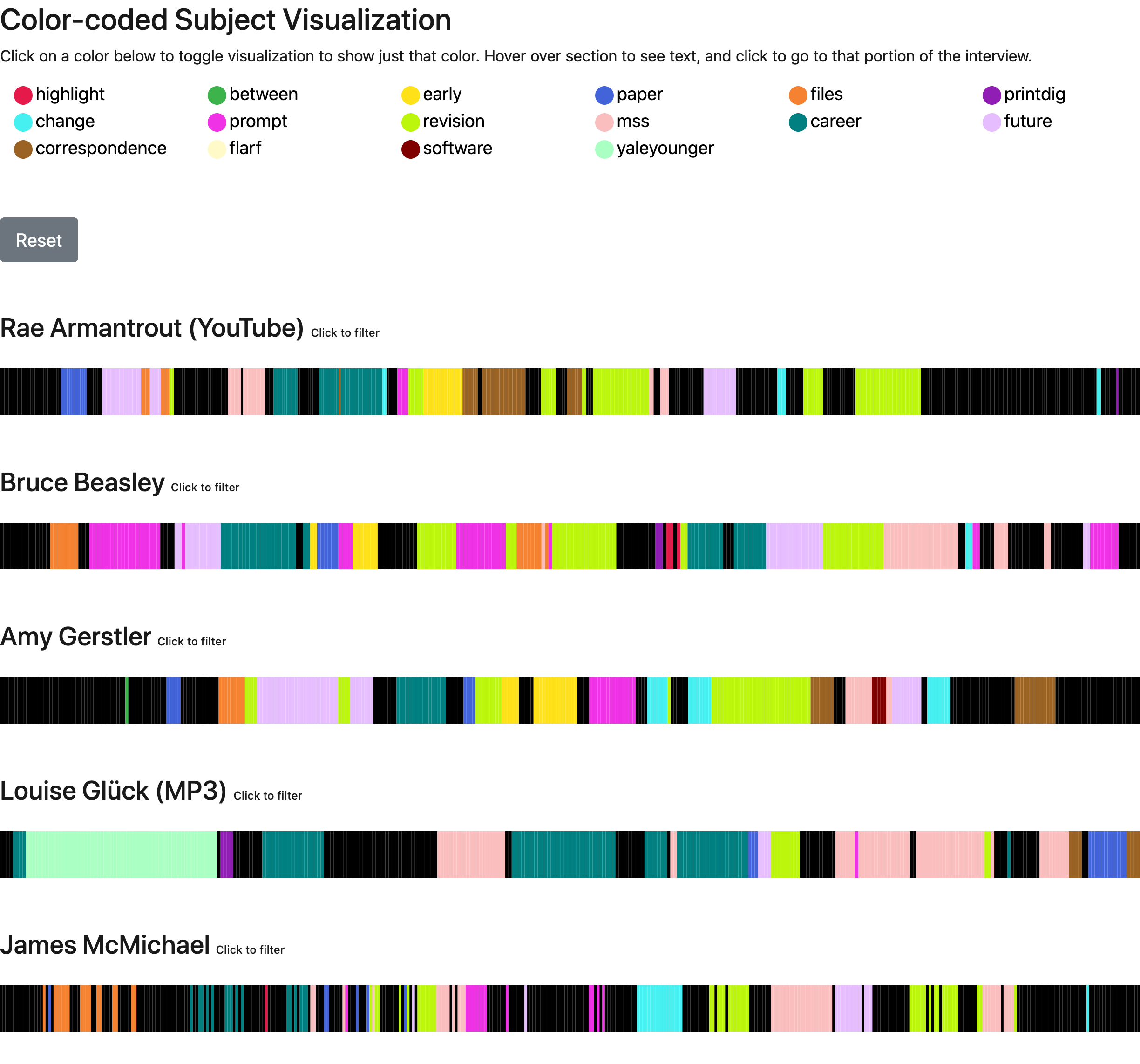
Understanding and Customizing Visualizations
The visualization system is a core feature of Oral History as Data, enabling researchers and users to visually explore coded interview content. This guide explains how the visualization system works and how you can customize it for your specific needs.
How OHD Visualizations Work
Oral History as Data creates interactive visualizations by:
- Reading the tags from your transcript CSV files
- Matching them to the color definitions generated from your
_data/filters.csvfile - Rendering colored segments that represent the coded sections of each interview
- Providing an interactive interface where users can:
- Filter by specific tags to see only relevant content
- Click on colored segments to view the associated transcript text
- Navigate between related content across multiple interviews
The visualizations are displayed at the top of the page, with filterable transcript content below.
Customizing the Visualization System
Modifying Tag Colors
Colors for transcript tags are automatically assigned in the _includes/transcript/style/filter-style.html file using a color cycle. To customize these colors:
Option A: Edit filter-style.html (Recommended)
- Create a copy of
_includes/transcript/style/filter-style.htmlin your repository - Modify the color cycle list with your preferred colors:
<style>
  {% for n in site.data.filters %}
  {% capture color %}{% cycle '#e6194b','#3cb44b','#ffe119','#4363d8','#f58231','#911eb4','#46f0f0','#f032e6' %}{% endcapture %}
  .{{ n.tag | slugify }} {
    fill: {{color}};
    border-color: {{color}};
  }
  .{{ n.tag | slugify }}.primary-{{ n.tag | slugify }}{
    fill: {{color}} !important;
  }
  {% endfor %}
</style>
Option B: Override with Custom CSS
- Create a file called
_sass/_custom.scss(or edit if it exists) - Add CSS targeting the tag classes with
!importantto override default styling:
/* Custom tag colors */
.education {
  fill: #8B4513 !important;
  border-color: #8B4513 !important;
}
.technology {
  fill: #4682B4 !important;
  border-color: #4682B4 !important;
}